Author Archives: Michael O.

The Holidays Are for Special Characters

It’s that time of year when people come together to celebrate the holidays. Although most of my family is local, we all gather only during the holidays. And if your family is anything like mine, you have your fair share of odd ducks. There’s the born-again uncle, who will preach your ear off. There’s gramdpa, who has become a bit peculiar in his declining years. There’s the cousin, who needs to dial it down on the Ritalin. Then, there’s the other side of the family, who are Dutch. Don’t get me started on the Dutch; they are just too weird for words. Despite all their foibles and eccentricities, we love our families. Where else can you find such a colorful collection of special characters.

Speaking of special characters…. Sorry for the painful, cheesy segway.

As businesses grow internationally, and as languages commingle and borrow words from each other, we must be able to type diacritics and special characters that do not appear on our standard keyboards. Words and phrases that we use frequently, like résumé, café, cliché, über-, and à la carte require accented characters. Mathematical symbols and some punctuation are further examples of special characters.

Continue reading

Anatomy 201: Type Measurements

When discussing or working with type, it’s not only important to understand the anatomy of the parts of letterforms, but it’s also important to understand how type is measured. We’re accustomed to measuring things in inches, yards, or miles, or, heaven forbid, the metric system. Type, on the other hand, has its own system of measurement of which most of us have a vague understanding. For example, most of us understand that normal body text is set between 10 and 12 points, and 72 points is much too large for everyday use. Few of us, however, really know what a point really is.

What’s the Point?

Type Measurements

Type is generally measured in points and picas. These measurements can easily be converted to inches.

A point is a unit of measurement held over from the olden days of manual typesetting. Points are used to measure the size of a font and the space between lines. Another measurement, the pica, is used to measure the length of a line of type. You probably won’t use picas unless you are using a page layout application like Adobe InDesign.

The following table describes the relationship between points, picas, and inches.

12 points 1 pica
6 picas 1 inch
72 points 1 inch

Type purists would tell you that there are actually 72.27 points per inch. The difference, however, is nearly imperceptible, and most software programs use the 72 points per inch measurement unless you change the default settings.

You can write out type measurements in a variety of ways. For example, 18-point type could be represented as 1p6 or 0p18 in pica-speak.

I know working in points and picas is difficult to get used to, but if you’re serious about typography and page design, you’re going to have to suck it up. Measuring in inches is fine for our example of 18-point type (or 1p6). 18 points is easily converted to 0.25 inch. If your type is set to 16 points (or 1p4), however, the conversion to inches is not so simple: 0.2222 inch.

Size Matters
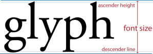
Font Size

The size of a font is measured from just above the ascender height to just below the descender line.

Font size can best be described as the measurement from the bottom of the descenders to the top of the ascenders, but, technically, there’s a little space below the descenders and above the ascenders that gets counted in the font size of computerized type. For example, if you were to measure from the bottom of the descenders to the top of the ascenders of Times New Roman set at 72 points, you might only measure 66 points.

Back in the day, the font size was measured by the actual block the metal type was mounted on. The metal type was not mounted to the edge of the block, so that little space below the descenders and above the ascenders is another holdover from the days of manual typesetting.

There are additional terms that are used when measuring spaces or indents, but spaces are a topic for another day.

Anatomy 101

Before I jump too far into discussing type and typography, it is important to understand the anatomy and vocabulary of type. Although this information appears on many web sites and virtually every book on typography, I’m rehashing it here because this blog is a comprehensive typographic resource.

You may have noticed that an uppercase A is drastically different than its lowercase counterpart (a), and indeed, very different than the letter Z. Before we can understand the differences between letters, we must understand the parts that make up letters.

Here are some of the most common terms that describe the physical characteristics of type:

  • Ascender. Ascenders are the parts of some lowercase letters that extend above the meanline. For example, the strokes in b, d, and h extend up.
  • Bowl. A bowl is the curved part of a letter that encloses a counter.
  • Counter. The counter is the space that is enclosed or partially enclosed by the strokes of a letter. For example, the hole or bowl created in such letters as b, d, o, and p are counters.
  • Descender. Descenders are the parts of lowercase letters that extend below the baseline. For example, the strokes in g, p, and y extend below the invisible line on which the letters sit.
  • Ear. An ear is the little piece that extends of the bowl of a lowercase letter. For example, many forms of the lowercase g have an ear.
  • Link. A link is a piece that connects two bowls. For example, some forms of the lowercase g have a link.
  • Loop. Like the bowl, the loop encloses a counter, but is specific to the lower part of the lowercase g.
  • Serif. Serifs are the finishing strokes or “feet” that appear in some typefaces. Typefaces that lack serifs are called “sans serifs,” which means, “without serifs.”
  • Thick and Thin. Thick and thin strokes are the different weights or thicknesses of lines in a letter. The thick and thin strokes denote the stress of a letter.
Anatomy of Type: The Parts of Letterforms

Anatomy of Type: The Parts of Letterforms

Here are some of the most common terms that describe the space occupied by type or the boundaries of type:

  • Ascender Height. The ascender height indicates the height of the ascenders of lowercase letters, which are often higher than the cap height.
  • Baseline. The baseline is the imaginary line on which the letters sit.
  • Cap Height. The cap height is the imaginary line that rests on the tops of capital letters.
  • Descender Line. The descender line indicates the floor of the descenders of lowercase letters.
  • Meanline. The meanline runs along the tops of the main parts of lowercase letters.
  • X-height. The x-height is measured from the baseline to the meanline and is so called because it is the height of a lowercase x. X-height varies from typeface to typeface and plays an important role in determining how dense type appears and how much space is required between lines of type.
Boundaries of type

Anatomy of Type: Space

This isn’t the end of your anatomy and vocabulary lesson, but it’s a good start.

Of Ligatures and Precocious Kids

I was trying to figure out when my interest in typography first reared its wicked head. My earliest recollection is of junior high school. I noticed something interesting in on of my literature textbooks, and I was perplexed. I noticed that when two lowercase F’s appeared next to each other in a word (as they do in “offer”) the first F appeared shorter than the second. The next day, I asked my teacher why the F’s were different. Exasperated, she looked at me like I was insane for even noticing something as innocuous as that and admitted that she had no idea with a huge sigh. Yes, I have always been a dork.

I know now that what I observed was a ligature.

Ligatures are typographic refinement that fuses two or more letters together to create a single glyph. There are many common ligatures: ff, fi, ffi, Th are among the most common.

Ligature Examples

Here are some common examples of two or more characters fusing to form a ligature. The typeface used is Adobe Garamond Pro.

Ligatures are used to avoid collisions that would otherwise occur between two letters. For example the terminal of the lowercase F (or hook at the top of the lowercase F) often collides with the dot of the lowercase I, but the use of the ligature omits the dot in the I and avoids the unsightly collision.

Such page layout applications as Adobe InDesign and Quark XPress will change character combinations to ligatures on the fly depending on your style settings.  Word processing applications like Adobe FrameMaker do not generally support ligatures. Microsoft Word 2008 for Mac supports ligatures, and Word 2010 for Windows will support ligatures.

While using ligatures can easily add that sophistication and professionalism your type so desperately needs, they are not always necessary or useful. For example some of the ligatures in the Futura typeface are bizarre looking and distracting.

You really should use ligatures only if characters in your body type are colliding. The characters in most sans serif typefaces, like Furtura, will never collide unless they are kerned too tightly (reduced letter spacing). By the same token, ligatures in serif typefaces with loose kerning (increased letter spacing)may appear tight when compared to the loose text around them. Heading text or display type, likewise, often look strange with ligatures.

Here’s the rule of thumb when it comes to ligatures: set all other formatting of your text before enabling ligatures. If you see characters colliding, enable your ligatures and watch those characters fuse.

Why Blog about Type?

Subway Sign

Type is everywhere. This subway sign was designed using Helvetica.

Why blog about something as inane (i.e., boring) as typography? Fonts, really? Really??

Those are fair questions to ask; although, I don’t necessarily like your tone. You might think that a well developed typographic acumen should be reserved for hard-core graphic designers and über-geeks, but type is all around us. From books to magazines, from television ads to billboards, from email to web pages, from letters to invoices, type is, for all intents and purposes, unavoidable. Despite the ubiquity of type, it goes relatively unnoticed by the general public.

I’m blogging about type here to promote an awareness and appreciation of typography and page design.

When it comes to typography, what you don’t know can hurt you.Considering all of the outlets for typography that I mentioned earlier, anything you write is competing for your readers attention against a plethora of other media.

For example, when I was hiring manager, I noticed that I subconsciously spent a lot less time looking at résumés with poor typography and page design than I did résumés that were easy on the eyes, and I noticed I was doing this before I ever studied typography. I wasn’t being a type snob, I was just busy, and the thought of working harder to plough through ugly type and bad page design was not appealing to me. I have a feeling that I was not the only hiring manager who was busy, nor the only one who passed over ugly résumés.

I don’t want your résumé to get passed over, your report to be sent straight to the shredder, or your presentation to bomb due to some unintentional typographic faux pas or another.

This blog is intended for anyone who writes for a living, writes as part of their job, or just has an idle curiosity for type and a lot of spare time to read blogs. This blog may interest professional graphic designers and typographers for its pithy observations, its quirky anecdotes, and my unwitting mistakes.

Happy reading!
—Michael