Tag Archives: graphic design

Outlining Text in Adobe Acrobat X

This article describes how to outline text in Adobe Acrobat X. An older article has information about outlining text in Acrobat versions 7, 8, and 9.

16 April 2013: It looks like Adobe broke this feature with an update to Acrobat. Fortunately, a trick that worked in prior versions still works, but it adds a couple of small steps to the procedure. I have updated this article accordingly.

By far, the most popular article on this blog is about outlining text in Acrobat, a task that became notoriously difficult after Acrobat 6.. An update post for Acrobat X is long overdue.

The Scenario

Here’s the scenario I posed in my previous article on outlining text: you need to make a small change to a graphic file, the deadline is looming, all you have is a PDF, you don’t have access to the source files, and you don’t have the fonts installed. Without the fonts, you can’t open the PDF in Illustrator without jacking up the text. You can’t wait to get access to the source file because you’ll lose your place in your commercial printer’s queue. What do you do?

The proposed workaround is this: open the PDF in Acrobat, outline the text, save your changes, open the PDF in Illustrator, and make your minor adjustments there.

Outlining Text in Acrobat X Pro

In Acrobat X, the process of outlining text is much easier than it was in versions 7, 8, and 9. Adobe restored the ability to outline text without having to fuss around with watermarks or other workarounds. The trouble is finding the feature. It’s buried in the Flattener Preview window, which is buried in Adobe’s answer to Microsoft’s ribbon based navigation.

Again a few caveats before proceeding:

  • The text will retain its formatting, but will no longer be editable.
  • If the PDF is going online, screen readers for the visually impaired will not be able to read it.
  • If the problem you want to fix is textual, you’re pretty much screwed. You’ll need to edit the source files.

Follow the steps below to convert text to outlines in Adobe Acrobat X Pro:

  1. Open the PDF or EPS file in Acrobat.
    (You want to open the file in Acrobat, because Acrobat will display the type correctly, using fonts embedded in the file, even if the fonts are not installed on your computer.)
  2. Click Tools and click Pages.
  3. Click Watermark and select Add Watermark.
    The Add Watermark window opens.
  4. Type a period (or any other character) in the Text text box.
  5. Drag the Opacity slider to 0%.

    Applying a watermark in Acrobat.

    You’ll need to add a textual watermark before outlining the text. Kick the font size down and set the opacity to zero so the watermark doesn’t interfere with the appearance of your document.

  6. Click OK.
  7. Click Tools and click Print Production.
    If you don’t see the Print Production panel under Tools, do this:
    a. Click the View menu.
    b. Select Tools.
    c. Select Print Production.
    The Print Production panel opens under Tools.
  8. Click Flattener Preview.

    Accessing Flattener Preview can be a little tricky.

    The Flattener Preview window opens.

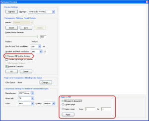
  9. Select the Convert All Text to Outlines check box.
  10. Select the pages you need to convert to text from the Apply to PDF group.
  11. Click Apply.
    Flattener Preview settings

    Simply select the Convert All text to Outlines check box.

    If Acrobat warns you that the operation cannot be undone, click Yes to proceed.

  12. Click OK to close the Flattener Preview window.
  13. Click File and select Save As to save your outlined text PDF as a different file from your original.
  14. Close the file in Acrobat and open it in Illustrator.
    You’ll notice that the text displays as it should, because it’s outlined. You can’t edit the text, but at least you can change the graphics to your heart’s content.

    Outlined Text

    Outlined text displayed in Illustrator. In this example, “Fonts!” is selected with the Direct Selection tool.

Outlining Text in Adobe Acrobat

Update 27 July 2012: This article describes how to outline text in Adobe Acrobat  versions 7, 8, and 9. A newer article has information about outlining text in Acrobat X.

Okay, this post does not have much to do with typography per se, but we’ve all been (okay, not all of us) in that situation where we need to replace a graphic or make a small change within a PDF or EPS file at the last minute. The deadline is approaching, the printer is waiting, your designer just left for a three-week vacation and took her files with her, or worse, your designer isn’t on vacation, but doesn’t understand what it is you want to begin with. So, you throw up your hands, figure you know enough Illustrator to get yourself into trouble, and decide it would be faster to fix it yourself.
You open the PDF or EPS file in Illustrator, and what do you get?

Adobe Illustrator error: Font Problems

A message saying you don’t have the fonts installed on your computer. Of course! If you proceed by clicking Open, the type with the missing font will be reformatted using a font that you have installed on your system, thereby, undoing your designer’s beautiful typography. Whatever you want to fix isn’t worth that headache.
What you should do instead is open the PDF or EPS file in Adobe Acrobat Professional or Extended and convert the text to outlines.
A few notes before you should consider doing this:

  • The text will retain its formatting, but will no longer be editable.
  • If the PDF is going online, screen readers for the visually impaired will not be able to read it.
  • If the problem you want to fix is textual, you’re screwed. Call your designer who’s on vacation; she’ll need to modify the source file. (You will owe her for the rest of your life.)

This procedure used to be fairly straightforward until Adobe released Acrobat 7 a few years ago. Now, it’s a little tricky. Follow the steps below to convert text to outlines in Acrobat Professional or Extended:

  1. Open the PDF or EPS file in Acrobat.
    (You want to open the file in Acrobat, because Acrobat will display the type correctly, using fonts embedded in the file, even if the fonts are not installed on your computer.)
  2. Click Document, select Watermark, and select Add.
    The Add Watermark window opens.
  3. Type a period (or any other character) in the Text text box.
  4. Drag the Opacity slider to 0%.
    Add Watermark window
  5. Click OK.
  6. Click Advanced, select Print Production, and select Flattener Preview.
    The Flattener Preview window opens.
  7. Select the Convert All Text to Outlines check box.
  8. Select the pages you need to convert to text from the Apply to PDF group.
  9. Click Apply.
    Flattener Preview window
  10. If Acrobat warns you that the operation cannot be undone, click Yes to proceed.
  11. Click OK to close the Flattener Preview window.
  12. Click File and select Save As to save your outlined text PDF as a different file from your original.
  13. Close the file in Acrobat and open it in Illustrator.

You’ll notice that the text displays as it should, because it’s outlined. You can’t edit the text, but at least you can change the graphics to your heart’s content.
Outlined text in Adobe Illustrator

Everywhere You Look: Helvetica

The only movie I’ve purchased from iTunes is documentary called Helvetica. Yes, I own a copy of a documentary about a font, or more precisely, a typeface, and yes, I am probably the biggest geek you will ever meet. Shut up.

Helvetica, the typeface, is everywhere. You cannot escape it.  It is ubiquitous. Every day Helvetica tells us, “Do not enter,” “Public Parking,” or “Watch your step.” The IRS uses Helvetica on our tax forms. The EPA uses Helvetica. The television and motion picture rating systems use Helvetica. Next to Times New Roman, Helvetica is probably the most widely used typeface on the planet.

Brands using Helvetica

Many, many companies use some iteration of Helvetica as the typeface in their logos.

As a technical communicator, I am fascinated by typography. Different typefaces can create different moods, reduce or improve readability, and affect the overall persuasiveness of a communication. Helvetica, however, seems to transcend these characteristics of type. It is neutral, efficient, and utilitarian. For example, the following corporate names probably conjure up different feelings within you: American Airlines, Staples, Bloomingdale’s, Greyhound, Sears, Fendi, Crate & Barrel, Energizer, and Texaco. All of these companies (and many more) have chosen Helvetica as their corporate logotype, and yet, we probably never noticed.

When Helvetica was created for Linotype in 1957, it was an instant hit. Helvetica was clean and modern, and it was adopted by many corporations to modernize and revamp their images. Helvetica became even more popular when it was licensed by Apple and included with every Macintosh computer, and when Helvetica’s illegitimate (near identical, but not quite) twin, Arial, was included on every Windows PC. Legend has it, Microsoft created Arial because it was too cheap to license Helvetica. Whether this is true or not, I can’t say, but Arial has expanded Helvetica’s reach into our consciousness.

One graphic designer interviewed in Helvetica said that Helvetica is so ubiquitous that it’s like air—it means nothing. Another graphic designer said that using Helvetica was like saying, “Don’t read me—I will bore you to tears.” (Only he used much more colorful language than I can use here.)

Depending on the intent of your communication, you might want to steer clear of Helvetica—and Arial—unless you have a special need to assert your document’s neutrality or give your readers the impression that your document will bore them.

If you get a chance to watch Helvetica, take it. You’ll get a better idea of how typography affects mood and readability, as well as the history of one particular typeface. Here’s a trailer to pique your interest even more.

Writing in Style

There are, perhaps, hundreds of thousands of computerized typefaces to choose from. I have some 800 type families on my laptop. All of these typefaces can be a bit overwhelming, especially to the untrained eye. Fortunately, you can categorize most typefaces into one of seven groups. Granted, some typefaces will never easily fit into one category or another.

Like fashion, type styles have changed over time. Most type styles are derived from the time or place in which they were developed and gained popularity. Having said that, many typefaces that fit within a certain style may have been created outside of the time or place of origin typically associated with that type style. You can categorize most typefaces in one of the following seven type styles:

Type Styles

There are seven main categories of type. The blue lines indicate the angles of the stress, the slope of the terminals, and the brackets of the serifs.

  • Old Style. Old Style type is very legible, has minimal contrast between thick and thin lines, rounded brackets where the stokes and serifs meet, and a diagonal stress. The line through the thinnest parts of the O in the figure to the left shows the diagonal stress. (France 1600s.)
  • Transitional. Transitional type bridged the Old Style and Modern typefaces and had more refined serifs, greater contrast between thick and thin strokes, and moderately diagonal stress. (England 1700s.)
  • Modern. Modern type has even more contrast between thick and thin strokes, squared brackets where strokes and serifs meet, and vertical stress. (Italy 1700s.)
  • Slab Serif (Egyptian). Slab Serifs are characterized by very thick serifs, little or no bracketing, and little or no stress. (United States 1800s.)
  • Sans Serif. Sans Serif typefaces do not have serifs and typically do not have any stress. (Switzerland 1900s.)
  • Script. Script typefaces are designed to mimic handwriting and calligraphy.
  • Decorative. Decorative typefaces are designed to add splash to your documents, but should be used sparingly. Outside of bullet characters, decorative type probably has no place in your résumé.

Typeface styles are evocative. They’re reminiscent of the time and place in which they were created because they embody the art and architecture of the time and place of origin. Choose typefaces based on their associated mood and tone.

Form Follows Function

More important than the tone of our document, your type should be suited to the utility of your text. You should chose typefaces that are appropriate for the situations in which they will be read. For example a weighty serif typeface is appropriate for road signs. Could you imagine speeding along the expressway trying to decipher a road sign written in a lavish script typeface? You couldn’t. Likewise, a typeface with heavy serifs would be difficult to read in the setup instructions for a home theatre, where the user is probably crouched in a tight, dark space as he plugs in equipment. So, you can see that the utility of your text will generally dictate the tone and the style of typefaces you use.

Why Blog about Type?

Subway Sign

Type is everywhere. This subway sign was designed using Helvetica.

Why blog about something as inane (i.e., boring) as typography? Fonts, really? Really??

Those are fair questions to ask; although, I don’t necessarily like your tone. You might think that a well developed typographic acumen should be reserved for hard-core graphic designers and über-geeks, but type is all around us. From books to magazines, from television ads to billboards, from email to web pages, from letters to invoices, type is, for all intents and purposes, unavoidable. Despite the ubiquity of type, it goes relatively unnoticed by the general public.

I’m blogging about type here to promote an awareness and appreciation of typography and page design.

When it comes to typography, what you don’t know can hurt you.Considering all of the outlets for typography that I mentioned earlier, anything you write is competing for your readers attention against a plethora of other media.

For example, when I was hiring manager, I noticed that I subconsciously spent a lot less time looking at résumés with poor typography and page design than I did résumés that were easy on the eyes, and I noticed I was doing this before I ever studied typography. I wasn’t being a type snob, I was just busy, and the thought of working harder to plough through ugly type and bad page design was not appealing to me. I have a feeling that I was not the only hiring manager who was busy, nor the only one who passed over ugly résumés.

I don’t want your résumé to get passed over, your report to be sent straight to the shredder, or your presentation to bomb due to some unintentional typographic faux pas or another.

This blog is intended for anyone who writes for a living, writes as part of their job, or just has an idle curiosity for type and a lot of spare time to read blogs. This blog may interest professional graphic designers and typographers for its pithy observations, its quirky anecdotes, and my unwitting mistakes.

Happy reading!
—Michael